Rebranding NuView Life Sciences for the future of cancer treatment.
NuView Life Sciences was working in one of the most advanced areas of modern oncology, but its brand looked like a generic clinical startup. I repositioned the company as a bold theranostics innovator by building a sharper identity, a clearer story, and a modern website presence that matched the sophistication of the science.

Launching advanced science with a brand that looked ordinary.
NuView was developing next-generation radiopharmaceutical products in the emerging theranostics space, but the existing brand did not communicate innovation, precision, or market confidence. The company needed to look as advanced as the science behind it.
This was not a simple refresh. It was a repositioning.
The opportunity was to shift perception from “clinical company” to “theranostics innovator.” Instead of leaning into bland healthcare sameness, I built the brand around molecular targeting, controlled nuclear power, and precision oncology, giving NuView a more differentiated and future-facing presence in the market.
The new brand language fused science, structure, and targeted energy into a visual identity system that could communicate credibility to investors, clarity to partners, and optimism to the broader market.
A mark and message built from science, targeting, and momentum.
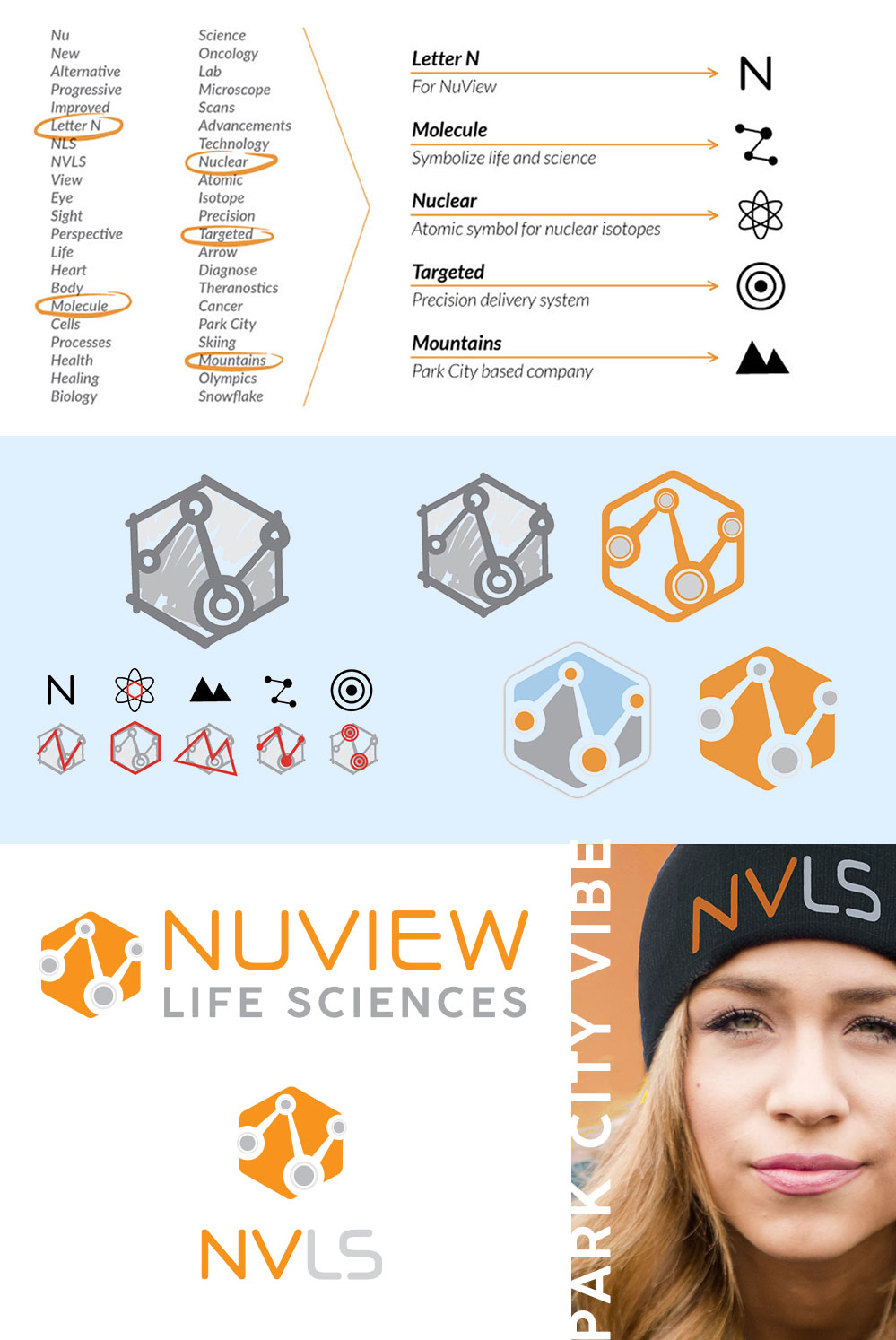
Logo system
The new mark brought together the letter N, molecular pathways, atomic symbolism, and a targeted-delivery feel to create an identity that felt distinct, scalable, and ownable.
Pipeline visuals
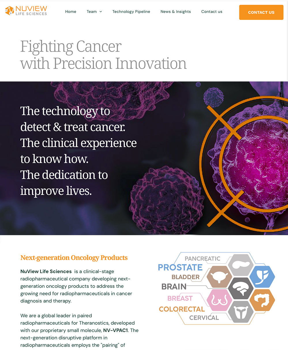
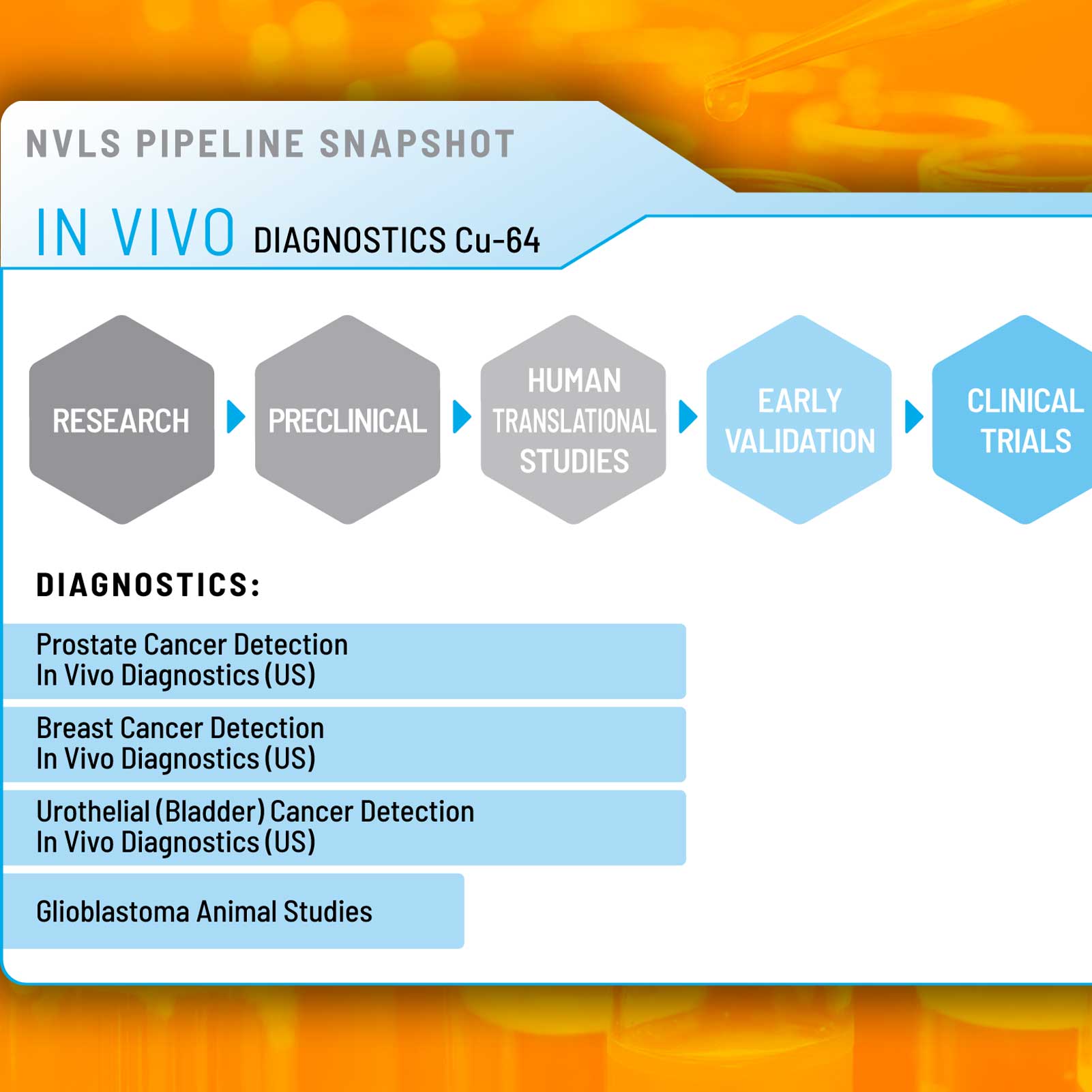
I translated highly technical product and pipeline information into clearer visual progressions, helping audiences understand NuView’s diagnostic and therapeutic programs at a glance.

Human-centered messaging
Social creative like “Cancer-free looks great on me” brought warmth and optimism into a highly technical category, proving the brand could live beyond the website and logo.
NuView now looks like the company its science says it is.
The rebrand aligned perception with reality, transforming the company from a generic clinical-looking brand into a modern oncology innovator built for theranostics, investment conversations, and future growth.
What the rebrand accomplished strategically.
Sharper market positioning
The new identity moved NuView away from generic healthcare aesthetics and into a more distinct, innovation-led category presence.
Clearer scientific storytelling
Website messaging and pipeline graphics made complex theranostics concepts easier for investors, partners, and clinicians to understand quickly.
Stronger investor optics
The rebrand signaled confidence, focus, and sophistication, elevating the perceived maturity of the company from the first interaction.
Scalable brand system
The identity proved flexible across logo use, the website, campaign creative, pipeline visuals, and branded applications like apparel and swag.
Strategy, differentiation, and visual confidence in one system.
It reflected the science more honestly
The new brand finally matched the sophistication of NuView’s work in radiopharmaceuticals and precision oncology.
It broke out of healthcare sameness
The identity moved away from soft, interchangeable clinical branding and into a sharper, more memorable visual territory.
It made complex ideas more accessible
Clearer messaging and stronger visuals made it easier to understand what NuView does and why it matters.
It created a foundation for growth
The rebrand established a system that can support future campaigns, investor materials, partnerships, and product storytelling.
From clinician-wannabe to category-ready.
NuView now presents itself as a company at the forefront of theranostics, with a brand that communicates innovation, precision, and the confidence needed to compete in a fast-moving oncology market.
NuView now looks like it belongs at the forefront of the future of cancer treatment.
This rebrand transformed the company from a generic clinical presence into a bold, market-ready theranostics brand built for the next phase of growth.